Building a Platform for Content Curation

Photo by Nick Fewings on Unsplash
After years of growth and development on evolving products, Afterpay decided it was time to apply the knowledge accumulated and create a consistent and focused direction across all products. One part of that plan involved rebuilding the website from the ground up to provide features and performance that Afterpay’s users deserve.
While Afterpay’s users have always been at the forefront of every decision, this time we decided that we would benefit from giving that same consideration to our internal teams too, specifically the marketing team who design and build all the pages you likely interact with.
The redevelopment set some goals that have a direct and positive impact on the teams at Afterpay and also have an indirect and positive impact for Afterpay’s users. It was also important to maintain the same or improved standard of service and functionality while meeting these new goals.
Goal 1 - Reduce time taken for the marketing team to build new pages
By making it easier and faster for the marketing team to build and deploy new pages, Afterpay is able to provide more appropriate content for the movements and events of the world. This helps our users discover the products and stores they’re interested in and makes our products more compelling and effective. Furthermore, we aimed to do this while reducing the time demand on the development team. This was a lofty goal but we had an idea of how we would achieve this.
Goal 2 - Reduce time for developers to build new features
It’s no secret that software development is expensive so naturally it’s a common goal to reduce development time. However this was less about the cost of development and more about getting features into the hands of our marketing team as soon as possible so they could create better experiences for the users.
Goal 3 - Improve design consistency \& align with global brand design system
Given the speed of development here at Afterpay it was only natural that the website and mobile app occasionally diverged visually. It was time to bring the two experiences back together and maintain them consistently. This also gave us the opportunity to have the mobile breakpoint of the website look and feel like the mobile app.
Looking at the goals you might have noticed that the developers deliver a feature-rich platform to marketing, and marketing delivers content to users through that platform. This delivery pipeline is very important to us but typically there are two ways this pipeline is achieved:
- Marketing team makes a request to the development team for functionality or visual changes on one or more pages to meet their needs.
or
- Marketing chooses the content to be displayed and selects one of a few pre-determines page layouts to display that data. New layouts cost development time.
Historically we’ve used the second method but neither of these were good enough for our new endeavour. We wanted to give the marketing team the freedom to create whatever structure they needed for their content and minimise requests for development time to get it done. This meant that our architecture needed to be modularised components, similar to “building blocks”, each piece is completely independent but functions seamlessly when placed together.
We needed to decide on an architecture that worked for us, the developers, as well as the marketing team and the users. What architecture would assist the developers to move quickly and confidently? What tools and frameworks would deliver the best user experience? How could we leverage the functionality of our choices to best serve the needs of the marketing team?
Lastly, improving the design consistency was expected to be easy for the development team because all the heavy lifting was done by the design team. We were confident we’d be able to implement the new designs in any architectural choices we were likely to make.
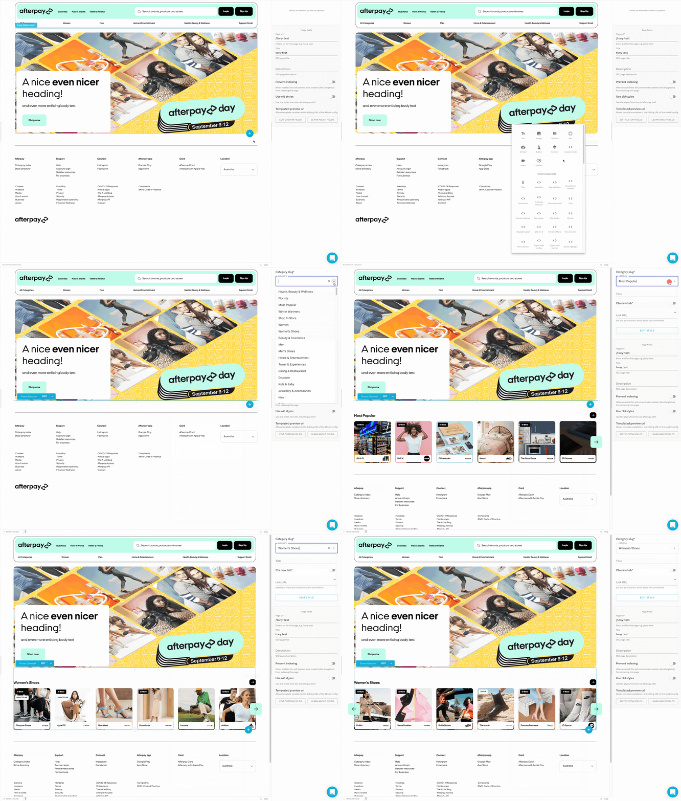
Developing custom made components is great for flexibility but you also need an intuitive way to arrange the components otherwise we’re back to needing developers to change static page layouts. While exploring options for a suitable tool for the marketing team, a few people suggested something they had used in the past - Builder. It was immediately apparent that Builder’s fantastic headless CMS and visual editor was what we were looking for and decided to attempt a proof of concept to really test it out.

As these things tend to go, one solution led to another, and we knew that Builder played well with React, and especially well with Next.js. The development team is very familiar with Next.js and were happy to use it. When looking for a modern framework, it doesn’t get a lot more modern than an isomorphic React framework like Next.js. Additionally we were confident that we’d be able to achieve the new global branding and consistent design with Next.js and, even better, the CSS Modules would help us achieve the isolation required for our building block architecture.
With this proof of concept underway we were testing the functional requirements but the other aspects of the goals, such as reduced development time, were still unproven.
It’s widely believed that one of the most effective techniques for improving development speed is to have a faster feedback cycle. No matter what minor aspect of software development you’re talking about it’s usually better to receive feedback as soon as possible. You need to prove the code works, or doesn’t, as fast as possible. Changes need to be visible quickly, deployed quickly, and tested quickly. The sooner you can answer a question about the solution the sooner you can move on to the next question.

As it turns out, breaking a solution into independent components naturally hastens the feedback loop because we’ve reduced the scope and complexity to the bare minimum required but we had a problem - having completely independent components made it hard to develop a new component from scratch because there was no framework for the component to sit in. How does this component get data? How does it interact with the navigation library? What about authentication?
It was clear to us that we needed a development harness.
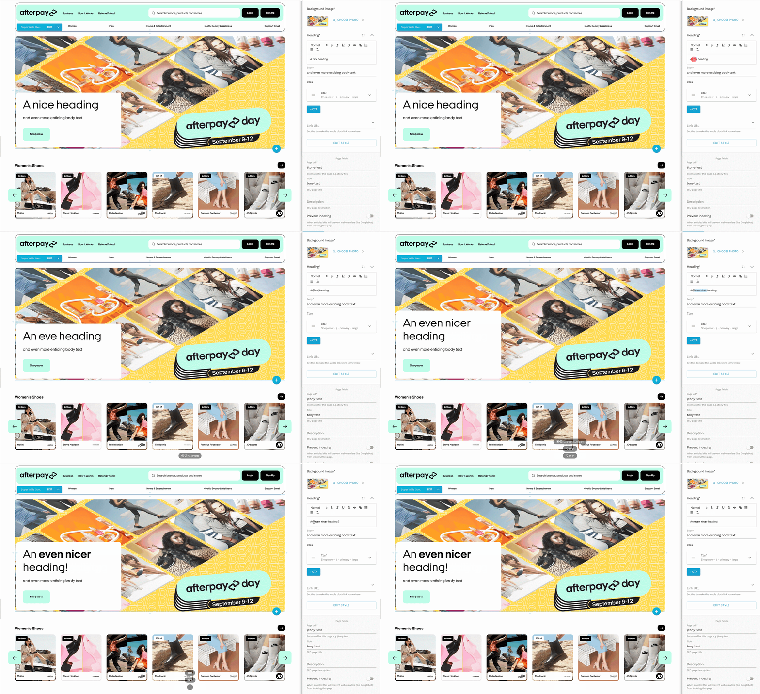
We were able to achieve a development harness with Storybook and, wouldn’t you know it, there’s a Builder integration to take it even further. With this in place each of our components could be independently viewed and interacted with. It also gave us the ability to create the standard supports the component should expect to have access to when used in production. For example the navigation library has state for the current route and functionality invoked when clicking on links. Within Storybook we were able to set up the state and stub the functionality so the component behaved correctly and didn’t need custom code to be viewed in isolation during development. As long as the stub matched the real implementation we wouldn’t have any issues and we knew this was the case because we were using Typescript and sharing the type between the real implementation and the stub.
While some of the development team had figured out the process using Storybook, another part of the team had finished the proof of concept with Next.js and Builder. The PoC had a great user experience for the marketing team and didn’t add much overhead for the development team. Everything was looking great.
Quick recap to make sure we’ve covered our goals, we set out to:
Reduce time taken for the marketing team to build new pages
By providing flexibility through composable components we enabled marketing to express their creativity and they no longer relied so heavily on the development team for implementing unique experiences.
Reduce time for developers to build new features
When the components in our library weren’t enough, the development process for creating more of them was efficient and reliable which reduced the time taken for new components to reach the hands of the marketing team.
Improve design consistency \& align with global brand design system
Every component created was made to the specifications of the global brand designs, meeting the goal for design consistency across all products.
We took great effort to understand the problems, the desired outcomes were well defined, and we did the work to prove the solutions we proposed were the right ones. We had set ourselves up to succeed and it had paid off, we had our new architecture and it was well received by our users, our marketing team and our development team.
The new site launched globally in March of 2021 and has been used by millions of users. Now that the dust has settled on the complete redevelopment of our website, we’re embarking on a new phase of development to expand the functionality to better service those users. While we work on that, the marketing team is continually serving up deals, new stores and new products in their enhanced tools with better personalisation than ever.
Interested in joining us in a Software Engineering role and helping us improve lives for millions of consumers around the world, every day? Consider joining our team.